Friday, April 24, 2015

The Annotated Mess


Photos courtesy of 'The Mudge."
Copyright © Edward Riojas

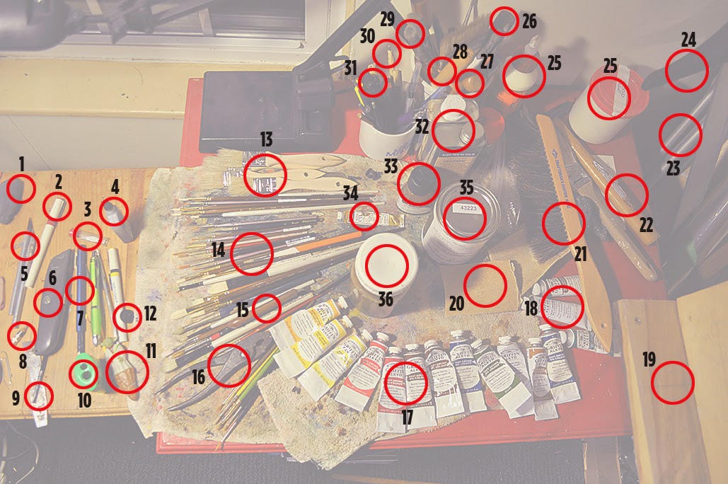
Being an artist is interesting. While an art pencil may seem pretty dull (pardon the pun), artists typically have a bunch of other crap at their disposal – most of which is pretty nifty. Like faucet wrenches, some artist tools are highly specialized and don’t get much use. The same tools, however, are indispensable when needs arise. A lot of small items share the space of my ten by ten-ish “studio” space, along with two enormous wall easels, a large studio easel, a drawing board, a couple of stools and some tables.

To satisfy the curiosity of those who’ve asked and to expand the horizons of those who haven’t, here is a look at the stuff that populates two of my small art tables.  For all of you: Please pardon the organized chaos. And yes, I know where everything is. Unless it’s lost.

1. Kneaded eraser: These have several uses, first of which is to erase drawing marks without leaving crumbs behind. They are also great for relieving stress by mashing them in your hand, and for creating small sculpted heads when inspiration strikes. You can tell this particular eraser is old because it is dark gray – when new, they are a light, bluish-gray. To keep them clean, you simply knead them until the drawing material is worked into the eraser.
2. Technical pen: These glorified fountain pens come in various sizes for the different weight lines they create. A fine wire slides inside a tube to bring ink to the point. Computers rendered their drafting use obsolete (another pun), but I still use them for illustrating.
3. Extra X-Acto blades: You never know when one will get dull or break.
4. Technical pen ink: It’s like India ink, but formulated to a smooth, non-clogging consistency for tech pens.
5. X-Acto knives: Used to put a fine point on pencils and for a lot of other general use.
6. Utility knife: Used for basic cuts on mat board, foam-core and any other dense material that X-Actos can’t handle.
7. Pencil extender: This one started out as an adjustable eraser tool, but was later used to hold pencil nubs.
8. Pencil nub: Art pencils cost more than a buck apiece, so I get as much out of them as possible.
9. Paint can opener:  Duh. I use latex wall paint on murals, so this guy is kept handy.
10. Pencil sharpener: Double duh. Because I usually use an X-Acto knife to sharpen pencils, this is mostly ballast.
11. Yoda Pen: Uh, I don’t have a clue.
12. Tech pen wrench: When a technical pen goes dry or needs cleaning, this little piece of plastic is the first choice. Then a pair of pliers, then vice grips, then the trash can.
13. Chip brushes: I use these cheap 1-inch types for large areas on murals. Otherwise, they sit around looking pretty, or get swiped for kitchen use.
14. Paint brushes: This is death row for my brushes. Most come in with long handles that get lopped off before use. I don’t use very large brushes, and I only use “rounds” and “filberts.” When brushes have worn down too much or start deviating from perfect form, they get unceremoniously pitched.
15. Palette knife: This guy is used either to move paint around on the palette or to scrape dried paint texture off the canvas. I don’t paint with it.
16. Pliers: Old paint tubes with encrusted screw caps do not argue with this tool. Ever. My vintage pliers also sport a screw driver on one arm.
17. Alkyd paint tubes: I use this quick-drying oil paint instead of traditional oils. I also use a limited palette. From left to right, colors are: Indian yellow, Cadmium yellow medium, Naples yellow, Cadmium red medium, Alizarin crimson, Burnt umber, Burnt sienna, Prussian blue, Sap green, Titanium white and Yellow ochre. The next two – Pthalo blue and Pthalo green – are rarely used. I do not use black paint because it “kills” all other color. Instead, I mix a color from two deep colors to make something much deeper than black. Cool, huh.
18. Extra paint: More of the above waiting in the wings.
19. Wall easel: This is a corner of one of two giant, temporary easels each set up in my studio to accommodate 8 feet-wide paintings.
20. Sand paper: Used to sand rough edges of paint brushes whose handles have been lopped off.
21. Horse hair drafting brush. I either use this or a large, clean paint brush to wipe off eraser crumbs while transferring drawings to painting surfaces.
22. Tack hammer: I’m too lazy to put it back where it belongs, but I used it once to stretch a canvas old-style – Belgian linen and copper tacks.
23. Portable easel: It was a gift from my parents during high school and still finds uses, though not for painting.
24. T-square: Yeah, I’m old school. The wide straight edge is wonderful when cutting mats.
25. Two containers of wood glue: I use this stuff when building painting surfaces. Because it can’t be allowed to freeze, I bring it inside during the cold months.
26. Etching plate burnisher: This thing hasn’t been used in years because I haven’t done etchings in years. But I might one of these years, so it keeps me company.
27. Burins: For the same reason, these engraving “chisels” stick around. Made of hardened steel, they teach copper plates a thing or two.
28. Agate burnisher: I’ve used this thing almost nearly once. It has a smooth agate stone on the business end for burnishing gold leaf. I’ve never used real gold leaf and certainly can’t afford it now, so there the thing sits.
29. Pouncing brush: Every crafter who’s ever done stenciling knows what this animal is for.
30. Drypoint stylus: Another etching tool made of hardened steel, it is a beautiful tool sporting a spiral twist.
31. Pen handle: This is old, OLD style. I’d have to do some digging to come up with nibs for this dipping pen that’s used with India ink.
32. Paint solvents: I waffle between Grumtine, with it’s retro, citrus odor, and an odorless, brush-cleaning solvent.
33. Liquin: I used to mix my own painting medium using one of Rembrandt’s recipes, but this off-the-shelf medium is perfect for thinning thick paint and for glazing.
34. Gold oil paint: With sacred pieces, this is sometimes used for nimbi.
35. Gold marine paint: This is a different, pricy alternative for select projects. A quart of this costs more than $60, although, hmm, the equivalent of the smaller tube (above) probably costs much more than that.
36. Brush-cleaning jar: If I’ve learned one thing about oil painting, it’s this: You don’t need gallons of solvent to clean brushes. This jar has made it through several large projects with only adding a half-cup or so of solvent. It has a small piece of hardware cloth just below the surface. After a paint-laden brush has been wiped thoroughly with a rag, the brush is rubbed over the hardware cloth and then wiped on a clean part of the rag. Particulate paint matter settles to the bottom of the jar, displacing the clean solvent and raising its level in the jar. Less than one drop of solvent is used in the process.


Friday, April 17, 2015

Requiem for Rubble

Nearly gone: A sliver of The Press building is all that was left at this writing. The top floor had been sheered off. The remnant of the floor below, including the Editorial Department, was where I worked. (Photo courtesy of the 'Mudge')
Copyright © Edward Riojas

Sniff. I can be such a sentimental guy.

For nearly 30 years I worked as an illustrator/designer in The Grand Rapids Press building on Michigan Street in downtown Grand Rapids. A few years ago the operations in that building were parceled out to different nearby locations in efforts to streamline the company and make it more relevant to industry needs. I now work in a pleasant-enough office space that was reclaimed from a giant Press truck garage, and I’m still doing pretty much the same thing. Sort of.  But now the old Press building is coming down.

Partly because other folks have written their memorials for the facade and partly because I’m so darned attached to hideous buildings, I’ve decided to offer my insincere condolences to those who also walked the not-so-hallowed halls of tasteless architecture.

As soon as I heard the site was being sold to the MSU medical school, I knew the building was toast. A handful of silly people surmised the building might be reconditioned to fit the needs of a medical research facility. Wrong. Imagine a three story, split-level structure designed for one purpose, and on prime real estate acreage. Now imagine it with 1960s architecture. Imagine it with green copper exterior crap and a decidedly “avocado” finish that would have matched your fridge – you know, the one  you hauled to the dump 30 years ago? Yeah, that one. The Press building was designed to be dozed.

Like many neighboring structures, the old Press building was erected using 1960s urban renewal mentality. If you like Kleenex boxes – green and tan and brown Kleenex boxes – then you like the architecture. But you should probably know that tissue boxes are designed to accommodate nasal mucus and not much else.

I find it a little strange that folks get so nostalgic when facades like this come down. Every sentence begins with “Do you remember when...” I was in one of the last groups to finally vacate the building, so my sentiments go something like this: “Do you remember when the ceiling tiles got stains on them, and when they bulged under the weight of leaking water, and when they were taken out and not replaced, and when wires were left hanging down?” “Do you remember when the office seemed like a set for some post-apocalyptic movie about zombies?” All we needed were 50-gallon drums with fires to warm our fingerless gloves, and maybe an ax or two.

A coworker recently reminded us all that, “According to a 2012 environmental site assessment, the 4.3-acre site includes concentrations of arsenic, barium, cadmium, chromium, copper, lead, mercury, selenium, silver, zinc, benzo(a)pyrene, benzo(a,h)anthracene, fluoranthene, fluorene, naphthalene and phenanthrene.” Nice. And I felt bad whenever I got a spot of India ink on my desk top.

The Press building, once vibrant and supporting 800 or so employees, then forlorn and rotting, is now being pecked apart by heavy equipment to make way for something new. The old Press building’s soul – the one that worked there and was offered buy-outs; the one that was laid off; the one that was divided and was told to report elsewhere – left years ago, and is now in a better place.

Friday, April 10, 2015

Awful Writing, on Purpose

Copyright © Edward Riojas

The Bulwer-Lytton Fiction Contest comes around once a year with tongue-in-cheek kudos to some of the most awful writing on the planet – and it’s written that way on purpose. The contest pays homage to an old piece of fiction that has acquired a rather poor reputation among those truly blessed with writing skills. For some folks, the passage is only noteworthy because Charles Schulz often put the opening words of the maligned sentence in Snoopy’s manual typewriter:

“It was a dark and stormy night; the rain fell in torrents — except at occasional intervals, when it was checked by a violent gust of wind which swept up the streets (for it is in London that our scene lies), rattling along the housetops, and fiercely agitating the scanty flame of the lamps that struggled against the darkness.” — Edward George Bulwer-Lytton, Paul Clifford (1830)

Acknowledging that I am not the best writer, I thought I would push the ugliness of my words in an artsy-fartsy direction, following the contest’s only criteria that each entry be a single sentence, and in the process create some not-so-lovely contest fodder. Don’t even think of plagiarizing my words, because I’ve already entered them in the contest. Besides, that little circled “C” thingy next to my name should mean something.

Below are my four entries. Wish me luck, and enjoy. Or not...

— Squat Carl teetered on the cutting edge of ripe indifference, sitting before a stand of olive trees painted by Van Gogh, pitting the oil, as Carl was so seldom prone to do, against Modigliani’s reclining nude.

— Greg smeared green in a wide swath over the canvas, although it wasn’t a grass green as he had at first thought but rather a sappish green closer to yellow ochre, with a touch of umber – burnt; not raw – and perhaps a bit of pthalo green thinned out with a little liquin, acquired as his brush skimmed over the previous-day’s blob of slightly tacky, but not completely dried out paint that apparently was not completely wasted.

— What was more, Eugene was less inclined to think of fine art as a whole instead of halfheartedly considering the whole “Less is more” principal, which he subscribed to in part most of the time.

— The most grandiose visions filled with countless meanderings; the most articulated considerations of cerebral thought unflinchingly denuded by esoteric ambivalence and bourgeois meaningless; the most inconsequential ramblings of inartistic mediocrity could not, Gwendolyn thought, pollute her minimalist mind.


Postscript: I received notification from folks that the Bulwer-Lytton Fiction Contest that my entries were “Arrived and archived.” I’m pretty sure that's code for ‘Chucked in the dumpster.’

Friday, April 3, 2015

An Altarpiece for the Suffering

“Isenheim Altarpiece,” Matthias Grünewald (painting),
and Niclaus of Haguenau (sculpture). 1512-1516.
(Musée Unterlinden, Colmar, France)

Copyright © Edward Riojas

It is one of the most celebrated masterpieces of the Northern Renaissance. The "Isenheim Altarpiece" is now displayed in the well-lit Unterlinden Museum in Colmar, France, where visitors comfortably meander among its dismantled sections cordoned off with tasteful stainless steel and glass barriers. This was not always so.

This masterpiece was neither intended for the well-heeled nor the healthy. Neither was the altarpiece destined for a cathedral, nor even a church. It was intended for a hospital of the suffering poor and terminally ill. For the dying, it was a flickering earthly vision of the sacred before death came to call.

Ergotism was among the common maladies cared for in the hospital built by the Brothers of St. Anthony. It was a nasty illness brought on by eating fungus-infected rye grain. It was a disease of the poor. The illness attacked the central nervous system and caused convulsions, hallucinations and gangrenous skin infections. It’s certain end was death. Ergotism – also known as St. Anthony’s Fire – was but one of many illnesses borne by patients of little means at the Isenheim Hospital.

This hell-hole of misery and infection was where Matthias Grünewald’s altarpiece was meant to be. For that very reason, it is good to ponder the artist’s piece on this Friday we call “Good.”

One need only look at some of the alternate side panels of the altarpiece to see the fantastically-weird side of Grünewald. He pulled no punches when depicting demonic forces and their affect on the dying – including The Christ.

The crucifixion panel does not spare viewers the ugliness of a tortuous death. Christ’s head has fallen hideously to one side. His lips are blue in death. Jesus’ skin is decidedly green. Tendons have been pushed aside by spikes driven deep, contorting his splayed fingers. Feet are out of joint from bearing dead weight.
Detail of the Crucifixion panel, "Isenheim Altarpiece"

Grünewald’s vision of the suffering Lord is like no other artist’s. The viewer experiences revulsion more than pity. Nails in the hands and feet, a crown of thorns and the pierced side can all be checked off the usual list of Crucifixion must-haves, but the artist added something that certainly struck a chord with the hospital’s suffering patients: Pockmarks of an infected Man.

This is significant. It goes beyond the obvious and points, by means of analogy, to the reality of sin’s total infection. While hanging on the cross, no one would touch that dying, infected body with a ten-foot pole. Not even The Father. The Son became a carrier of our dread disease, but in dying, The King of all creation dragged sin, Satan and death to its own tomb. Even the newness of the sepulcher hints at a macabre quarantine chamber: This place is not sterile. Do not come near this one. Seal it off.

This punishment – not simply a cruel death, but one heaped with the sin of the world – Christ endured. For you. For me.

But thanks be to God that death, sin and Satan were defeated by the dead and risen Christ. The pockmarks of sin sloughed off in the tomb and stayed there. And thankfully, Grünewald saw fit to give equal play to this Resurrected Christ, whose countenance glows as a singular light of the world, shining with His promise of life everlasting.

And that is Good, indeed.