Friday, March 30, 2018

Banner Day for Christendom

Copyright © Edward Riojas

“The royal banners forward go...”

Legend has it that the Lenten hymn containing this phrase was written by Venantiaus Fortunatus to accompany a grand processional. The momentous event occurred in late 568 A.D. at Poitiers, when a supposed relic of the true cross was being presented to the church there. Fortunatus was given the distinction of formally receiving it, so it was that he and a contingent of dignitaries processed while singing the hymn.
"Resurrection" (Detail of fresco of
"Scenes from the Life of Christ."
Giotto. 1304-1306.
(Capella Scrovegni, Padua, Italy)

That legend slightly soils my appreciation for the hymn, but one would otherwise find it hard to stretch a Scriptural metaphor out of the title line. I seriously doubt royal banners were employed at common executions in Roman-occupied Jerusalem. Furthermore, Christians might view the cross of Christ as a singular royal banner, but not a multitude of them.

In sacred art, royal banners do appear, but not usually during the crucifixion of Jesus. The Resurrection is an entirely different matter. Banners became the rule in depictions of the Resurrection by the time the Proto-Renaissance rolled around, and it is Jesus Christ who carries them.

Origins of Christ holding a white banner emblazoned with a red cross are hard to find in Orthodox imagery. Oldest formulae in Orthodoxy show the resurrected Christ yanking Adam and Eve out of their graves. He pulls so hard at them that one wonders at the soundness of their rotator cuffs. When icons do give Jesus a free hand, He sometimes holds a staffed cross. Only in modern Eastern icons and Coptic icons do banners occasionally show up.
"Harrowing of Hell"
Martin Schongauer. 1480s.
(National Library of Russia,
St. Petersburg)


The Florentine artist, Giotto, was one of the earliest to depict the risen Christ with a resurrection banner. Soon others followed his lead, and it became a familiar pattern as the renaissance spread northward. But why the banner?

The answer doesn’t necessarily have to do with a living Christ. It points, instead, to the place from whence He just emerged. Holy Scripture briefly describes this in 1 Peter 3:18-20 – specifically with the phrase, “...He went and proclaimed to the spirits in prison.” He might have been proclaiming and preaching in hell, but it was a sermon of fire and brimstone and not much else. Christ descended into hell to proclaim victory over Satan and his minions. The banner is a victory flag.

One must be extremely careful to not read purgatorial nonsense into the passage of 1 Peter. Many have, and the result has created a whole genre of “the harrowing of hell,” which is Scriptural in name only. There is enough art to further the heresy. The Example by Schongauer, along with many similar images, borrows a motif from orthodox imagery and applies it incorrectly to Christ's visit to hell, showing Christ pulling “saints” out of hell. Scripture simply does not say that folks get a second chance after they are dead and gone. It doesn’t happen.
"Resurrection of Christ with Donor Family"
Lucas Cranach the Younger. c. 1573.
(Private collection)


But the resurrection DID happen, and it was a banner day for all believers. Remember that the next time you see a depiction of Jesus Christ – or the Lamb of God – holding a banner. It symbolizes that He has conquered sin, death, and hell, and has firmly rubbed Satan's nose in that fact.
Friday, March 23, 2018

For Holy Week

Copyright © Edward Riojas

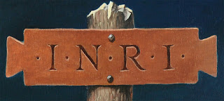
They say a picture is worth a thousand words. Today I'm letting a new piece do the talking, with minimal textual intrusions to explain some symbolism. "Crucifixion" was recently installed at Zion Lutheran Church, Garret, Ind.

Tabula Ansata: The inscription here follows a traditional artistic formula. It is a gross abbreviation of "Jesus of Nazareth king of the Jews" in Latin. The full wording was not only in Latin, but Greek and Aramaic, as well.


Christ's hand: Though fixed to the cross, His hand is in the attitude of blessing.


Crowned with glory: Jesus wears a crown of thorns, but His tri-radiant nimbus shows Him to be a Person of the Holy Trinity and true God.


From His pierced side: Blood and water flow, blessing us with the Sacraments of Holy Baptism and the Lord's Supper.


Place of a skull: Some traditions place the crucifixion of Jesus on the site of Adam's grave, underscoring Christ's victory over death and a reversal of man's Fall.


Bloodied, pierced feet: "How beautiful are the feet of those who preach the good news!"


__________________________

Giclée prints available: Images of "Crucifixion" are available as signed giclées prints on Hahnemuehle fine art paper. Two sizes are available: 12" x 18" for $80, and 15.9" x 24" for $120. Please email the artist at edriojasartist@gmail.com to order or for more information.


Friday, March 16, 2018

Cranach’s Little Reality Check

Copyright © Edward Riojas

We have been inoculated to the horrors of crucifixion. In part, time has done this. Culture has added to it. Even our own striving to make Christ’s death seem more special has complicated things.

One need only open a jewelry box to find proof as much. While I am certainly not against displaying crosses and crucifixes, when forced to think on it, precious metals and diamonds somehow seem far removed from the reality of a Roman torture device. When Fabergé gets into the act, you know a major threshold has been crossed.

For these reasons, I am grateful for the jarring images that occasionally catch my attention. Lucas Cranach the Elder’s “Crucifixion” woodcut is one such image.

As was the rule during the Northern Renaissance, historical accuracy of costume and place was exchanged for what the artist knew. The setting, dress, armor, and trappings shown in Cranach’s 12 by 14 inch woodcut are distinctly sixteenth century German, including the flamboyance of feathered caps and puffed sleeves that would have been absent in Jerusalem. One might chalk it up to an already-diminishing sense of Biblical history during the Renaissance. And then Cranach throws a curve ball.
"Crucifixion" Lucas Cranach the Elder. 1502
(Museum of Prints and Drawings, Berlin)

While the pose of Jesus Christ follows formula depictions, one of the malefactors is shown in a morbid pose that stuns the viewer. The print shows that, while German dress had become more refined than Biblical garb, regard for criminals had taken a step backward. The man is hung upside down with an obvious broken back, and garroted by his own weight on the cross. So much for the advancement of civilization, and a kinder, gentler kingdom.

What is more, there is not simply a lone skull beneath the cross – as would usually be the case in giving a nod to “the place of the skull,” or acknowledging the spotty tradition that Christ was crucified over Adam's grave. Rather, several bodies lie rotting beneath the hooves of war horses. The viewer can almost sense the stench.

This scene is unsettling. It is raw and unorthodox. It does not back away from the reality of pain or punishment or death. It is not the kind of thing that would inspire a jeweled and enameled Fabergé pendant. It causes us to rethink our awful contribution to that singular, salvific act which our Lord endured on our behalf. It stops us from glorying in humanity. And ourselves. For all these reasons, Cranach’s little print is well worth noting.

Friday, March 9, 2018

On Mikhail Nesterov


"Holy Rus" Mikhail Nesterov. 1905.
(The State Russian Museum, St. Petersburg)

Copyright © Edward Riojas

I sometimes feel foolish when I “discover” a wonderful artist. This, after finding out that I’m apparently the last to do so.

Such is the case with Russian artist, Mikhail Nesterov. I don’t rightly know what it is about Russian artists that makes them evade detection from the West. Perhaps it’s the Iron Curtain thing. Maybe it’s because they aren’t usually considered part of Western Culture, the foundation on which art survey courses are built. Maybe it’s because the West contents itself with its own wealth of talent. At any rate, Nesterov is worth bringing to light, either for the first time, or again for those who are already familiar with the artist.
"The Love Potion" Mikhail Nesterov. 1888.
(Radishchev Art Museum, Saratov, Russia)


Mikhail Nesterov was born in 1862. He was schooled in the academic style of the day, but surely influences of emerging movements, along with recently established styles had an effect on his view of art. He became part of a movement that challenged the academic style. Still, he was Russian, and his work contains a wonderful blend of his own culture, suffused with faint hints of the Pre-Raphaelites and Impressionism. Stylistically, he has been relegated to the Russian Symbolist style, but there is also contained in his work a strong sense of illustration, a discipline in which he partially earned a living.

The subject matter of his work was also an eclectic mix. He was pulled to one side by religious Orthodoxy, but the deep cultural history of Russia, and its emergence as a modern nation, was pulling on the other side. Nesterov’s “Holy Rus,” for example, is a puzzle. My heart tells me that the subject of the painting is Jesus Christ, but my head and the title of the painting tell me that it leans more toward a personification of Russia as the holder of all things Christian, and not necessarily Christ Himself.
"The Vision to the Youth Bartholomew"
Mikhail Nesterov. 1889-90.
(Tretyakov Gallery, Moscow)


Many of Nesterov’s other paintings contain folkloric flavors so endearing that one can’t help imagining they are either missing pieces of childhood, or rich visions of which J.R.R. Tolkien could only dream. “The Love Potion,” and “The Vision to the Youth Bartholomew” are among these.

His “Taking the Veil,” on the other hand, almost sidesteps the fact that the procession is made up of nuns and novices, and the viewer meanders beyond the figures, past distinctive buildings and birch trees, to solemnities unfolding in the background. Taking the viewer on such a journey shows mastery of storytelling under the guise of fine art.

Unfortunately, Nesterov was made to ride the rogue wave of post-Tsarist Russia. His daughter was brutally interrogated. Nesterov himself was imprisoned for two weeks. His son-in-law, accused of being a spy, was shot. As strange consolation, the artist was granted the Stalin Prize in 1941 for his painting of Pavlov. Nesterov died the next year.
"Taking the Veil"
Mikhail Nesterov. 1897-98.
(State Russian Museum, St. Petersburg)


A career spent in such a crucible did not bode well for the man. It probably never can. His work however, tells a different story, and I am not ashamed to have found it, even if I am the very last to do so.

Friday, March 2, 2018

Ode to a Face

Fraktur characters, above, and
Old English equivalents, below.

Copyright © Edward Riojas

I don’t usually get all geeky about things, but today I’m letting my hair down – well, what’s left of it.

Early on in my career as an artist of sacred themes, I learned that Holy Scripture is especially important where visuals are concerned. Although my work is representational and straightforward, I tend to get nervous about making sure my interpretation of the Word is accurate. To make up for whatever I think may be lacking, I usually put a portion of Scripture somewhere in my paintings. And that brings me to Fraktur.

The typeface, Fraktur, has become my go-to when designing text into my artwork. It is a more graceful, yet more robust font than its cousin, Old English. While the latter typeface has always retained a stiff upper lip, it gets overused. For starters, it’s on nearly every diploma known to man. Old English also ends up on blacked-out rear windows of ridiculous, custom, compact cars – in all caps. That sort of thing makes me blow a gasket.

Fraktur, on the other hand, is German, and it demands respect. Besides my slightly-strange fixation with its swashes and ligatures, I recently learned that Fraktur is also a typeface with pedigree.

We must thank Hieronymus Andreae, who designed the calligraphic face in the first place. That was the early 1500s. Andreae was a master formschneider, or woodblock cutter, which was a highly sought after skill with the advent of printing. His name probably doesn’t register with most folks, but Andreae’s associate, Albrecht Dürer, most certainly does. The Fraktur typeface was specifically created to be used in Dürer’s design of the massive woodcut, “Triumphal Arch,” which measured nearly 10 by 12 feet. Yes, a woodcut. Of course, something that ambitious didn’t begin as a doodle on a bar napkin. The piece was commissioned by the Holy Roman Emperor, Maximilian I.

Unlike Old English, which fell out of use in favor of Roman-based fonts during the 17th and 18th centuries, Fraktur had staying power. It was still widely in use in the early 1900s – mostly in Germany, but also in a smattering of other northern European countries. The typeface had such a rich lineage that it became the face, in more than one sense, of German literature. And that was the eventual reason for its downfall.

Fraktur might have had its origins with such German notables as Maximilian I and Dürer, but it only took one German knucklehead to ruin everything. The font suddenly didn’t fit well with official military communications during WWII, and modern typefaces quickly overtook the stately font. Perhaps more significantly, being thoroughly German suddenly had a stigma attached to it. No longer was Fraktur used as body copy in published literature.

Today the typeface only occasionally shows up in newspaper mastheads, or in places where a touch of regal historicity is needed. I kind of like that. A lot.

Detail of "Resurrection," using embellished Fraktur typeface. Edward Riojas. 1999. (Collection of Our Savior Lutheran Church, Grand Rapids, Mich.) Copyright © Edward Riojas.