Friday, July 15, 2016

A Federal Project

Copyright © Edward Riojas
Various posters
created for the WPA
Federal Art Project


I always get nervous when the Federal government decides to get involved in my life. I get even more nervous when the intrusion involves art.

There are plenty of federally-funded arts programs kicking around today. If an artist feels the need to get help, say, in a public project involving education and art, chances are there are funds lurking behind a ream of paperwork to make the idea a reality. Of course, chances are you will also be forced to be inclusive to a fault, and be supportive of ideologies and agendas that would otherwise annoy the heck out of you. That’s Federal government for you.

Once upon a time, however, there was a massive project created by Uncle Sam to shore up the art community when buying bread was trouble enough, let alone considering art for the wall. During the Great Depression, the WPA created the Federal Art Project. The program ran from 1935-1943. Its uncreative, monochromatic title hid behind it a godsend for approximately 10,000 artists and artisans across the U.S., providing them with work, commissions, and the encouragement that someone actually cared for their interests during the leanest of times.

In spite of the program being designed by the Federal government, there were very few strings attached. There was no stipulation on style or approach. Abstract art, though not yet economically attractive to most artists, and therefore somewhat rare, was as permissible as representational art. Browsing through examples from the project, it’s easy to see influence from the Arts and Crafts movement, regionalists, ala Thomas Hart Benton, and even Mexican muralists.

Where did this artwork find itself? Everywhere. School hallways suddenly sprouted murals, painted by funded artists. Zoo posters, travel posters, health posters all showcased the talent of project artists. Pieces destined for government spaces were created by the same.

The project employed so many artists that some familiar, artsy-fartsy names ended up on the roster years before they made names for themselves. Jackson Pollock, Willem de Kooning, Joseph Stella, Mark Rothko, Louise Nevelson, and even, hmm, Mexican muralist Diego Rivera all benefited from the Federal Art Project. That's Federal government for you.

For my part, I enjoy the flavor of pieces that had little to do with future movers and shakers in the art world. The pieces were created during a time that was less hip and more Howdy Doody in spirit, and that is what makes the artwork so genuine and charming. Then again, perhaps the “retro” label will make them even more attractive than they already are.

“The Bauxite Mines” Mural by Julius Woeltz. 1942. (U.S. Post Office, Benton, Arkansas)

Friday, July 8, 2016

Painting the Face of God

Copyright © Edward Riojas

Sometimes sacred artists are at a serious disadvantage.

Painting a face is work enough. Some art students avoid modeling the human face on paper and canvas as if it were The Plague. Mastering the properties of light and applying them to the nuances of a likeness takes years of education and practice. Sometimes even that much doesn’t help.

But what of the face of Christ? What kind of a challenge is that?

Sure, He is a man in every sense, so it follows that the same approach to recreating a visage of the average man can be applied in like manner to our Savior. Jesus Christ, however, is also true God in every sense, and therein lies the challenge.
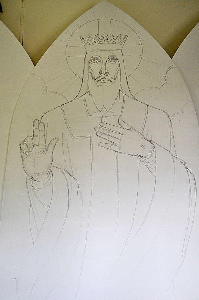
“The King of Kings Chancel Piece”
(In progress) Edward Riojas.


Someone recently asked me of one of my sacred pieces, “Where is the light source?” A simple enough question. Whether the person was genuinely unclear or whether they were trying to find fault and increase their own artistic superiority, the question got me thinking – and not about getting more art credits under my belt.

How does one paint the face of God? The same that once killed stupid folks in a fleeting glance is now often what I stare at for hours at a time. How can the principals of light and shadow be applied to the Creator of those same principles? How can one come even remotely close to representing the visage of He who is Light of Light; He who shines with uncreated light; He in whom there is no shadow of turning; He who is the Light of the world?

Self-preservation can be a useful thing. Otherwise, I might go mad being consumed by the enormity and impossibility of portraying an infinite, multi-dimensional Christ and confining Him on a finite, two-dimensional surface. I would die the same death of Old Testament unfortunates when faced with the face of God.

Yet The Lord is gracious. I am not destroyed; He preserves me. The miracle – beyond being preserved by the Lord – is that He gently guides my hands with His own, even without my knowledge, to show what I otherwise cannot, and by it reminds those who view my work that His face is infinitely worth the seeking.

Friday, July 1, 2016

Art from the Front

Copyright © Edward Riojas
“Tanks”
Muirhead Bone (Scottish)
1918. (Imperial War Museum


Another Fourth of July. For a lot of people that means carcinogenic tube-steaks on the grill, Chinese pyrotechnics, and complaining about the lack of sleep after a long weekend. It’s so ’Mer’can, isn’t it?

For those citizens with more than half a brain, however, the national holiday is an opportunity to reflect on our freedoms, and the high cost of having and preserving them. Today, I take a look at art from the front lines. No, not the edgy, artsy-fartsy crap that raises the hackles of regular folks – I’m talking about combat art.

Creating “plein air” art is again a trendy thing. Capturing the essence of an outdoor scene without overworking it draws heavily on the gestural and impressionistic side of an artist’s noggin. If that seems like lots of fun, then try it with bullets whizzing by your head, thump-thump-thumping of guns in the distance, and adrenaline pounding in your veins.
“March Macabre”
Kerr Eby (Canadian) c. 1943.
(U.S. Navy Combat Art Collection)

.
Combat artists have brought the reality of war to life for so long that the tradition of drawing on front lines surpassed photography’s introduction. Initial drawings done on the line are sometimes re-worked into well-developed pieces, but what I admire most about combat art is the gestural feel in much of it. Even when artistic ability is lacking, respect must be paid those who are able record a moment of hellish history which words could not otherwise convey.

The ranks of combat artists, which are long indeed, have included some notable names. John Trumbull, Winslow Homer, Thomas Nast, and John Singer Sargent, among others, gained fame of a different sort after their tours of duty. The artists also come from many nations, including those who were historically our enemies.
“GIs caught in a flare on a snowy road...”
Howard Brodie (American) 1945.


The pieces I’ve included here caught my attention on artistic merit alone – the quality of line; the handling of color; the sensitivity of subject – but it is the subject in combat art that always trumps presentation. The rawness of feeling, the disjointed context of place, and the drain on the human spirit better help us understand the cost of our freedoms and what it has taken – and still takes – to preserve them.

“Landing Zone”
John O. Wehrle (American)1966. (National Museum of the U.S. Army)

Friday, June 24, 2016

The Ideal and the Real

Copyright © Edward Riojas

Her face is serene. His face is majestic, yet gentle.
“Portrait of a Woman with a Winged Bonnet”
c. 1435. Rogier van der Weyden.
(Berlin State Museums, Berlin)


These are descriptions of the ideal, and can be applied to the face of the Virgin Mary and the face of our Lord, Jesus Christ, as depicted by artists throughout the ages. They were intentionally painted this way, and attempted to give the viewer a sense, albeit foggy, of the piety of the one who bore God, and the majesty of God Himself. The visage of an average man would not do. It could not do. The artist strove to push beyond the mundane to the sublime. But those faces weren’t real.

It is a difficult pill to swallow for Classical artists, that in striving for something greater they ultimately arrived at something less. The faces of Christ and the Virgin Mary are often plastic. They are not of this world. I suppose that was the point.

To see the true abilities of portraiture during the Northern Renaissance, one must steer clear of the heavenly sphere, take it down a notch, and focus instead on the middling nobility. Two of my favorite artists of the period, Rogier van der Weyden and Robert Campin, displayed exquisite sensitivity to the human face.
“Portrait of a Lady” c. 1460
Rogier van der Weyden.
(National Gallery of Art, Washington D.C.)


I have always been taken by van der Weyden’s “Portrait of a Woman with a Winged Bonnet.” If the viewer can possibly ignore her beautifully-tailored frock and voluminous headpiece, he might get a glimpse of the gal down the street or the one tending the cash register at the grocery store. Her gaze is informal and nonchalant. The smile out-does Mona Lisa’s by a mile and a half.

Another portrait by van der Weyden, “Portrait of a Lady,” would have us believe the artist was leaning a bit too far toward plastic and needed a reality check. There is a definite lack of life in this gal. Perhaps the artist was taken by the sitter and worked the painting past its prime. Perhaps she was annoyed at having to sit at all. It smacks of someone with a life, and sitting for an artist was not at the top of her itinerary. Still, there are hints that a real person sat for van der Weyden – the pronounced lower lip, the squared jaw, and a couple of delicate eyelashes deny any sense of idealized beauty and counterbalance her unresponsive eyes.
“A Woman”1435. Robert Campin.
(The National Gallery, London)


Robert Campin brings us back to reality with “A Woman.” Copious amounts of fabric frame the visage of this woman who, I am sure, sits across the aisle from me at church. It is somehow pleasant and unnerving that we look at a real person in time, rendered so lovingly, and knowing it is entirely accurate and true to the person – without us having a clue at all.

The trick of mastering the face, as good portraitists know, is not in the tip of the nose or in the color of the eyes. The delicate nuances of facial character are found in more unlikely places – the corners of the mouth; the outer edges of the eyes; the shallow above the chin; the cheek line. It is found in spaces between the features. The artist at this point must be razor-sharp in observing, because the tolerance of spatial distance between features is nil. Move an eyebrow a fraction of an inch, and the portrait becomes someone else. This radical intolerance within the face is the bane of inexperienced artists, a wonder of creation, and proof that we are all unique and very special in God’s eyes.

Friday, June 17, 2016

Sacred Art Speaks to Human Tragedy

Copyright © Edward Riojas

There’s nothing like tragedy to make men religious. It’s a sad fact that neither learned thankfulness nor natural introspection urge men closer to God as quickly as dire need and senseless tragedy. (As if there were such a thing as “sensible tragedy.”)

Events like the recent ones in Orlando smack almost hard enough to make us give up our ways of life and act as we know we should. Almost. Those same events also make us seem even dumber than we are. Everyone starts asking questions – deep questions. Permutations of the “Why?” question pop up in the wake of tragedy. Folks want answers to the cause. People want answers to questions they cannot – or dare not – ask.

Holy Scripture, of course, has answers. And that, of course, is an understatement. Sacred art that is faithful to Scripture sometimes gives answer, as well. Perhaps by coincidence, I was recently working on a chancel piece for King of Kings Lutheran Church in Frankenmuth, Michigan, and I took notice of the pose in which I put Christ.
“The King of Kings Chancel Piece”
(In progress) Edward Riojas.

The well-worn pose can be found in many images of The Christ. His right hand, with three fingers extended, is in an attitude of blessing. His left hand, however, is in a rather relaxed position against His breast. That same position is often used in classical art to show thoughtfulness or devotion – usually among women. But it takes on a larger meaning when applied to Jesus.

Yes, Jesus was thoughtful toward mankind and devoted to our salvation, but there is something beyond those understatements. As if anticipating a question during tragedy, He is poised with an answer even before we ask. Tragedy sometimes causes us to ask “Who is in control?” or even “Who is caring for us?” With the same powerful answer that brought down the Roman guard; with the same reply that defines who Christ Jesus really is; with a deeply-caring, assuring voice, Christ answers, “I am.”

Friday, June 10, 2016

Pedestrian Art

Copyright © Edward Riojas

I am pretty sure the temperature was above 100° F. I was creating a chalk drawing on asphalt in the northeast corner of a large parking lot. It was a clear day with a gentle breeze out of the southwest. I had to take an early break, head home, and switch into swim trunks – I was sweating that profusely.

That was the inaugural year of the West Michigan Chalk Art Festival, held during a day and a half in Byron Center, Michigan. I had never tried sidewalk art before, and hadn’t even drawn on a sidewalk as a kid. I was new to the concept, and so was the committee that dreamed up the Chalk Art Festival. Hence, I was drawing very much alone in a vast expanse of simmering blacktop.
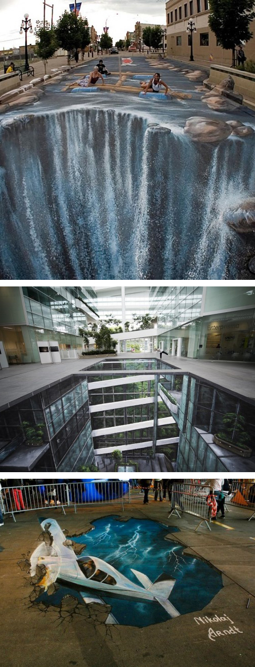
A small sampling of sidewalk
art from around the world.


At the end of the first day, I covered up my well-developed drawing with plastic, sealed it with tape, and hoped the threat of rain wouldn’t materialize. It rained. The next morning I was eager to see the damage and make repairs before the mid-afternoon judging.

Just a small amount of rain had seeped under the tape, but it was hot enough that a greenhouse effect was generated under the plastic, creating a bigger mess from condensation.

I repaired the drawing in time for judging, and walked away with the title of Grand Prize Winner and a check for $1,000. I’ve won several times in different categories since that inaugural year, but I am still very much a novice – embarrassingly so – in a medium that, in some parts of the world, carries a monstrous WOW-factor.

Spectators don’t realize that creating sidewalk art is extremely grueling. Sure, it looks like fun. The idea of working outside and under a canopy on a nice day seems a breeze. It isn’t. Sitting on hard concrete, or squatting on it, or leaning on it for long hours takes a toll on knees and shoulders and back. The palms become sore. Fingers take the brunt of the abuse. One year, an extremely-green novice working next to me abraded off all his fingerprints, and it took a week before his hands stopped shaking and tingling. Dehydration, sunburn, and heat exhaustion can also menace the sidewalk artist who is not cautious. All this a sidewalk artist endures to create some of the most temporary art on the planet.

Yet the images can be exquisite. Mind-numbing, realistic images seemingly emerge from nowhere. One common denominator in award-winning sidewalk art is use of trompe l'oeil via a single viewpoint. This is accomplished by taking a two-dimensional image, grossly distorting it, and transferring it with a grid system to the pavement. These images make for wonderful photo-ops, but if viewers stray from the intended viewing spot, then everything goes visually haywire.
“The Ambassadors”
Hans Holbein the Younger. 1533.
(National Gallery, London.)


Crowds love this sort of thing, and who can blame them? That an artist would sacrifice so much time and energy on a totally distorted, massive image for the sake of a single, fleeting viewpoint is annoyingly intriguing. But it isn’t so novel an idea.

Nearly 500 years ago Hans Holbein the Younger executed a painting of two movers and shakers of his day, “The Ambassadors.” In typical fashion, the image was replete with objects symbolizing the ambassadors’ spheres of influence and knowledge. But an odd shape stretches across the foreground. It makes no logical sense unless viewed from a specific point below the painting. Only then does an unnerving symbol of death reveal itself.

Part of the charm of sidewalk art is that, while neither carrying the esthetic heft contained in an art museum, nor signatures of Holbein or Michelangelo, it uses time-honored, enjoyable principals of fine art and exposes them to the masses. Pedestrian art may last only a day or two until the next downpour, but the wonder and memory of well-conceived pieces more than justify their worth.
“The Ambassadors” (detail)
When viewed from below.


The West Michigan Chalk Art Festival will take place June 17-18 at the Tanger Outlet Mall, U.S. 131 and 84th Street near Byron Center. The Curmudgeon will not be participating this year.


Friday, June 3, 2016

The Guilded Artist

Copyright © Edward Riojas

The English language is an ever-evolving thing, borrowing from other languages, changing usage, and inventing words out of thin air. Some words have been lost to time. Other words have lost their punch over the centuries, but we insist on using them anyway.

Folks throw around the words “master” and “masterpiece” as if enjoying a lazy game of catch. College professors bring up “modern masters,” and swanky art mags attach the “masterpiece” label to any pile of rubbish the latest up-and-coming ottist has churned out for the masses.

Once upon a time, this was not so. There were few masters. There were few masterpieces. Those titles were laboriously earned, and were seldom bestowed. Yes, it was elitist. And it took place under the auspices of what was essentially a union.

Unions were then known as “guilds,” and artists were part of the guild system. While there were variations of guilds throughout Europe, and though many such organizations experienced a rise and fall of popularity, the basic framework they used then is not so foreign to the modern mind.

Guilds often made use of a ranking system to differentiate between novices and experienced professionals. There was no confusing between apprentices, journeymen, and masters.

Talented young artists were referred to a guild or a master member of a guild. Most often these novices were teens or pre-teens who showed an aptitude for art. They were given the title, “Apprentice,” and did menial labor in an artist’s studio, including sweeping the floor. The idea was that they would become familiar with the artist’s environment, the methods and tools of the craft, the pace of activity, and the language of the craft. It was akin to an internship, but with few initial responsibilities. If anything, it was learning by osmosis.

Through his tenure, the apprentice gained knowledge and respect, and was slowly allowed to apply his own abilities to the processes used by the master. At some point, it was decided the apprentice be given a new title. In a slightly odd, but very insightful turn, the lad was shown the door and given license to work along side other masters in distant lands, hence the title, "Journeyman." During the Renaissance, this might mean heading to Florence or Paris. Exposure to different approaches to the same discipline broadened knowledge and deepened ability, while the journeyman absorbed customs and cultures unlike his own.
 “St. Luke Drawing the Virgin”
Rogier van der Weyden. 1435-40.
(Museum of Fine Arts, Boston)


Once the artist felt confident of his own techniques and abilities, he would head home and make application to the guild. Often there was a monetary requirement. Always there was an artistic requirement. In an ultimate test of skill, the artist created one piece that would satisfy the heavy scrutiny of the guild’s masters. It was like a doctoral thesis and dissertation mashed into one massive attempt at acceptance. If given approval, the artist earned the title, “Master.” His piece – the “masterpiece” – was usually given to the guild.

Artist guilds were often named after St. Luke, who, by tradition, was a physician and artist. Images of the saint often show him painting, and St. Luke supposedly painted a portrait of Mary, the mother of our Lord. Not surprisingly, the subject of the masterpiece was often St. Luke painting the Virgin Mary.

Because of St. Luke’s connection with medicine, artists and physicians sometimes shared the same guild. But the connection to the apostle wasn’t the only link between artists and physicians. During the1200s, Florentine painters were associated with the Arte dei Medici e Speziali – the guild of physicians, apothecaries, and spice merchants. It may seem an odd fraternity of disciplines, but apothecaries and spice merchants were usually the source for artist’s pigments and were therefore integral to their craft.

Today, pigments are picked up at the nearest Hobby Lobby or ordered online from Daniel Smith or a host of other art supply dealers. You can still find pigment powders, but don’t bother your spice merchant or pharmacist for the same. Modern art trends are also a bit different than during the reign of guilds. Artists most often want a niche of their own, sometimes ignore the rules of design – even before learning them – and scoff at tradition and integrity. Mastery of anything is nowhere on their horizon. The result is that we now have a massive pile of masters and masterpieces, but in name only. And without the name, it is simply a pile.