Friday, June 26, 2015

Errant Sacred Art


Copyright © Edward Riojas

“So when Aaron and all the sons of Israel saw Moses, behold, the skin of his face shone, and they were afraid to come near him.” – Exodus 34:30

I don’t profess to be a Theologian, and I’m certainly no linguist. You won’t find Greek or Hebrew lexicons on any of my library shelves. I have a ton of English dictionaries on the same shelves, but those are a testament to what might be considered a deficiency in my command of the language. Meh. I digress.
“St. Jerome in the Wilderness,”
by Bernardino Pinturicchio. c. 1480.
(The Walters Art Museum, Baltimore)


When it comes to interpreting Holy Scripture, I rely heavily on pastors who can decipher the clarity of The Word as it has been written by inspired hands. I’ve been told there are words foreign to me that don’t translate well into English, and that goes for some found in the original Greek and Hebrew texts of Scripture. This is starting to sound like a recipe for disaster, isn't it?

Once in a while, a bad translation slips past the proofreaders, then breezes under the noses of theologians and finally gets signed off by a pontiff. Once in a greater while, worlds collide and that little goof gets handed off like a virus to another discipline. Such was the case in 382 A.D., when St. Jerome was at the translating helm, and such was the case when the Council of Trent (1545-63) finally put a seal of approval on the same translation – just in time for Renaissance artists to go running off with it. Dopes.
“Moses,” by Michelangelo. c. 1513-1515.
(Church of San Peitro in Vincoli, Rome)


First, let’s back up and pay a little visit to Jerome. The guy’s mug could be found all over the place in the art world, pointing to the fact that he was venerated and placed on a pretty high pedestal. His biggest achievement, aside from hanging out in caves and doing the hermit thing, was translating the Bible into Latin for the bigwigs in the Vatican. His translation is known to us as the Vulgate.

I guess we should give him kudos for the effort, but he managed a major fail on at least one little word, which in turn messed up a significant chunk of artwork that came out of the Renaissance.

For our sakes, that little, original word, when transliterated into English, is “karan.” That word has its root in another transliterated word, “keren.” Of course neither of these words mean a thing to me, and that’s where linguists in general and Bible scholars in particular come into play. Jerome was then at bat – in Mudville.
“Well of Moses (detail),”
by Claus Sluter. 1395-1403.
(Musée Archéologique, Dijon, France)


St. Jerome, when applying “keren” to the prophet Moses, traveled down one path of possibilities and translated the word as “horned.” [Face-palm] He should have chosen the path less traveled. Today, the same is translated as “shining” or “emitting rays.”

During the Renaissance, however, the Vulgate was THE translation. Messing with it could mean a little trip to the chopping block and a return trip, sans head. Artists, being prudently dutiful, were faithful to the translation, obedient to the Holy See, and captive to silliness. Thus, we have inherited a herd of famed prophets – sporting horns. Some look like elderly Pans, some look like Hellboy and some look like Satan himself. It’s embarrassing.

Let’s start with the big guns of Michelangelo. You can almost hear his version of Moses belting out the familiar strain, “I am Moses, hear me more, with horn-things too big to ignore.” Sit down Moses. Oh, you ARE sitting.
“Moses,” by José de Ribera. 1638.
(Museo di San Martino, Naples, Italy)


Next up is Moses from Claus Sluter’s “Well of Moses.” If anyone out there is keeping score, I really, REALLY like Sluter’s piece, which is handsome enough to warrant its own blog post. But Sluter’s Moses has Hellboy genes, for sure – it’s probably Hellboy’s dad, Hellpops.

To be fair, translating light into a solid is always a nightmare for sculptors. A nimbus, for example, always looks like a dinner plate when affixed to a sculpted head. 2-D artists, however, have no such excuse.

Painters tried hard to nail that ambiguous Hebrew word and often wound up with a pair of headlights on old Moses. I suppose we should be thankful the artists used only two rays of light, avoiding the tri-radiant treatment reserved for Persons of The Holy Trinity. José de Ribera painted Moses as the Mothman, with a couple of feathery, shiny, horn, uh, things. We’ll give José an “E” for effort.
“Moses with His Arms Supported by Aaron and Hur,”
by Thomas Brigstocke. 1840-1860.
(Aberystwyth University, Wales)


Unfortunately, some things are very hard to unlearn. Thomas Brigstocke’s “Moses with His Arms Supported by Aaron and Hur,” stuck with the headlights motif way after the Renaissance fact. But by the looks of it, Moses has had enough already.

It really is a pity that we’ve inherited this mess of errant art that mirrors a poorly translated bit of the Inerrant Word. If St. Jerome had only taken greater care with the original text, he would have set the art world on a much different path of esthetic expression, and that would have made all the difference.

Friday, June 19, 2015

A Tasteful Palette

“Luncheon of the Boating Party,” by Pierre-Auguste Renoir.
1880-81. (The Phillips Collection, Washington, D.C.)

Copyright © Edward Riojas

Yes, this is an art blog, but it’s summer and I’m hungry. After dragging through a protracted, depressing winter with only heavy comfort food to offset the somber hues of sun-starved days, it’s nice to revel in the fresh sights and tastes of the season. So today I’m pairing some art with one of my favorite summery sandwiches. The tasty concoction was inspired by an artsy-fartsy offering I once had in an Asheville, N.C., cafe, but I’ve given it my own spin.

First, however, a few art entrees.
“The Crayfish Season Opens,”
by Carl Larsson. 1897.


When I think of artwork and summer, I immediately think of the Impressionists and their near-obsession with sunlight. And when I think of dining al fresco, Renoir’s “Luncheon of the Boating Party” always comes to mind. In spite of a top hat or two, the whole composition is awash in casual ease. Straw hats and undershirts, striped sun awning, opened bottles of wine and distant boats underscore friendly conversation and musings of relaxed revelers. Renoir’s signature handling of paint adds to the liveliness of the setting, and the viewer can’t help but feel a tad jealous for not being able to climb through the canvas and into the warm celebration.
“A Bigger Splash,” by David Hockney.
1967. (The Tate, London)


Now we jump sideways into Swedish illustrator, Carl Larsson’s, “The Crayfish Season Opens.” His classic approach to Scandinavian life has a light-handed feel, and this particular piece is a perfect addition to our menu. I know little, if anything, of the lowly crayfish and its place in Swedish gastronomy, but it is evident that the delicacy is somehow equated with summer. The outdoor table, smiling hostess and beckoning water pull at our imagination, and the viewer finds himself yearning for a morsel – if not a plateful – of summer sunshine and all the bounty it promises.


David Hockney may not be your cup of iced tea, but this painting, “A Bigger Splash,” has fierce, mental staying power and I cannot help but think of a perfect Summer day when confronted by its pure color and simple shapes. The character of light and splash of white entices us to find a martini, which must certainly be just out of view, and leave behind our wet footprints.
“Zuleika,” by John Singer Sargent.
c. 1906. (Brooklyn Museum, Brooklyn, N.Y.)


John Singer Sargent supplies my last offering before we heat up the stove. Known for his oil portraits of the rich and famous, Sargent was also a prolific water-colorist and a master of the figurative landscape. His “Zuleika,” harkens to the Impressionists, and minimized brush strokes maximize the feel of dappled shade and a summer breeze. The form is ambiguous to the point that we are left wondering if the figure is reading a book, or dozing. Perhaps it is a bit of both. Either way, the cares of life have been put aside, if only for a season.

Summer has a way of putting us at ease, and we devour the long days and the warmth they offer. Autumn will come in its own time and usher in different colors and flavors. But now it is summer, and it’s time for a bite.

Edward’s Killer Sandwich
Servings: Whatever
Calories: Probably a lot less than that cheesecake you’ve been eying

This one just might convert the meat-eaters in your crowd. It’s packed with flavor, and it will fill you up without killing the diet. You can vary the ingredients a tad, but stay as close as you can to my ingredients. Above all, don’t cave in to the Philistine’s – avoid adding meat.


Ingredients:
Olive oil focaccia bread
Olive oil
Havarti cheese, sliced
Pesto
Mayo (optional)
Avocado, sliced
Artisan lettuce or fresh baby spinach
Tomato, sliced
FRESH basil leaves, whole

Directions:
Cut bread into sandwich-sized portions and slice horizontally to make matching halves. Liberally brush inside surfaces of bread with olive oil. Place bread on griddle. Use a water-filled tea kettle or some other weight to keep bread flat, and grill over medium heat, until deep golden brown.
Place cheese on one grilled half. Spread pesto and mayo (optional) on other grilled half. Layer remaining ingredients. Serve warm. Hint: If serving sandwich cooled and in an al fresco setting, keep ingredients separate until just before serving.

Friday, June 12, 2015

Composition Dissection

Copyright © Edward Riojas
“Madonna and Child,” by Bernardino da Asola.
c. 1530. (The National Gallery, London, U.K.)


Presumably, you are here because the title of this essay didn’t scare you away. It certainly scares me. The very word “composition” is enough to cause shudders among writers and artists alike. In the art realm, it’s an unnecessary idea that is applied, after the fact, to things we already know, but in no way wish to articulate.


Throughout art school I was faced with ever-present diagrams explaining the compositions of masterworks. The lines were superimposed on famous pieces of art. It was assumed that art students would follow the example and begin paintings with nearly invisible triangles and squares and straight lines circumscribed by larger circles, trapezoids and dodecahedrons and, in the process, create one great visual symphony. Meh. Years after school, I just do a painting and let someone else figure out the composition.

“Flaming June,” by Sir Frederic Leighton.
1895. (Museo de Arte de Ponce, Puerto Rico)

I know, however, that you are not all artists. For that reason I thought I would take a few famous pieces and explain – perhaps as no teacher ever has – how each artist composed their work. I've superimposed a few lines to show the obvious [duh] composition. And in case you are wondering how I managed to get into the artists’ noggins, I can tell you with confidence that I did so using the technique real smart folks have used through history – by guess and by golly.


Let’s start with something simple – the stable triangle composition. Take any Madonna and Child painting, like the example above by Bernardino da Asola, and you’re guaranteed to have a stable triangle. Same goes with any painting of a pyramid. Or one of those signs on Amish buggies.

Orange and Yellow, 1956,” by Mark Rothko.
1956. (Albright-Knox Art Gallery, Buffalo, N.Y.)

Now let’s flip that triangle. I hope you’re sitting down now, because this is an unstable triangle and your eyes might fall over.  Sir Frederick Leighton was obviously knighted for using lots of triangles – most of them unstable. And for using Orange. Nice frame, though.

Okay, this is getting boring, so let’s look at Mark Rothko, the overachiever. Don’t try too hard Mark, even though I know your target audience consists exclusively of an oatmeal box and a paramecium.

“Beech Grove I,” by Gustav Klimt. 1902.
(Galerie Neue Meister, Dresden, Germany)


Gustav Klimt made use of lots of vertical line-thingies and an annoying, not-quite-horizontal line in his composition of a Beech grove. I really appreciate his work, but maybe someone should have given him a level for his birthday.


“Starry Night,” by Vincent Van Gogh. 1889.
(Museum of Modern Art, New York)


And what about everyone’s favorite, Vincent Van Gogh’s “Starry Night?” Vince did something wacky by using lots of circular lines in his mesmerizing composition. I took a stab at linking some of his circles with visual lines, and even threw in the Big Dipper for help, but all I could come up with was the Great Choo-Choo constellation, which obviously went off the tracks at some point in his life.


“Descent into Hell,” by Hieronymus Bosch. c. 1555
(The Metropolitan Museum of Art, New York)

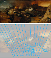
Some of the older pieces, like “Descent into Hell,” by Hieronymus Bosch, can give composition gurus hives. I mean, there’s so much going on in the painting – sight lines, counterbalance lines, azimuth lines, tangents and perpendicularities (Heheh, I made that one up). I’ve simplified things by just showing a bunch of lines going to hell in a hand basket. Makes sense to me.

I don’t think I’ve ever seen one of those composition diagrams superimposed on a Jackson Pollock painting, though. That just seems unfair, so you can thank me for helping you understand what’s visually going on in his painting. And when you DO understand, please tell me because, as is usually the case, I don’t have a clue.


“One Number 31, 1950” by Jackson Pollock. 1950. (Museum of Modern Art, New York)

Friday, June 5, 2015

Art Dances with Death

Copyright © Edward Riojas

“You are dust, and to dust you shall return.” Genesis 3:19b

There’s nothing wrong with feeling like dirt. Well, once in a while.

For sinner-saints in need of reminding that our only contribution to salvation is sin, Ash Wednesday comes all too infrequently with its dose of humble pie. This side of heaven, we are more apt to get swept up in the latest installment of ‘Downtown Arbies’ and all the insignificant crap in our lives instead of admitting we should be swept up in a dust pan and chucked out the back door.

An artist cannot delve into sacred art without at least once confronting the reality of death and that return-to-dust-thing. Even the joys of life eternal come at a cost, and sacred artists often look a dying Christ in the face for hours at a time, while contemplating that price. Christ crucified, however, is not the only vision of death found in sacred art. Artists have obliged us in showing that man’s earthly days have a relatively short shelf life, echoing the voice of the psalmist who prays, “Teach us to number our days.”
“The Triumph of Death,”
by Pieter Brueghel the Elder.
c. 1562. (Museo del Prado, Madrid.)


Throughout history, artists have depicted this reality in different ways. The slightly macabre, but symbolically realistic views point to our natural condition and certain earthly end. Sometimes the depictions of death are only on the fringes of a piece. At other times, they are pretty much in your face.

If you really want to brighten your day, take a gander at Bruegel’s “The Triumph of Death.” Mind you, the piece‘s title is about as heretical as it gets when you take into consideration Christ’s triumph over death. Still, it’s good to jar yourself out of all the concerns of soccer schedules and weekend plans on the boat, and take a peek at the alternative to everlasting life.

Bruegel‘s piece cuts to the quick. You won’t find anyone in the painting that‘s ten feet tall or bullet-proof. ALL die. The point is that some die eternally. The worm indiscriminately tunnels its way through mankind without care of position or wealth or title. The artist’s centuries-old depiction puts to shame the imagination of the Weta Workshop and its slick CG vision of ugly ork hordes. Hell is not pretty. Neither is its highway, nor its entrance ramp.
“Totentanz” [”Dance of the Dead”],
by Bernt Notke. c. 1463
(Originally in Marienkirche, Lübeck, Germany.
Fragment moved to St. Nicholas’ Church, Tallinn, Estonia.)


During the Black Plague, death was seen as the great equalizer. The “Dance of Death” was a common theme that was intended as a constant reminder of death, but instead of giving it a global dimension, the individual became the target.  Hence, a doctor might be shown dancing with skeletal death. So, too, a priest, as well as the Emperor. And if the joi d’vivre had not yet been sucked out of the viewer, there was also death stepping in time with a young mother. And don’t forget the two young lovers with an uninvited guest.

Bernt Notke‘s version of this was his “Totentanz.” Surely, it must have been enough to make one sit up and listen to the sermons in its original setting of Marienkirche in Lübeck, Germany. Death is paired up with a seemingly endless slice of society, and if the visuals weren’t pointed enough, there was a short bit of text to drive the nail home. Here is death whispering into the ear of royalty:

“Emperor, your sword won’t help you out
Scepter and crown are worthless here
I’ve taken you by the hand
For you must come to my dance.”

It is a bit sad that Notke‘s painting was badly damaged during a 1942 Allied bombing run, but it’s also relieving that we are spared dwelling too much on the obvious and despairing of it.
“The Parable of the Buried Treasure,”
by Edward Riojas. 2013.
(Collection of the artist).


Artists needn’t always get carried away with fire and brimstone. Sometimes a simple nod to death is sufficient.  In one of my own pieces, “The Parable of the Buried Treasure,” Jesus Christ is unearthing His treasure out of a field of stone. I thought the headstone of that “treasure box” would be the perfect place to sign the painting. It would also be confessional. And personal. It became more so when a fellow artist somewhat jokingly informed me that the date had, um, passed. It‘s the kind of reminder that’s hard to ignore, and that‘s good. There have been other reminders, too.

When my father died, I tackled a project that most would prefer to avoid. I built his casket. It was my personal way of grieving. I lost hours of sleep to get the thing finished in time for the funeral (as if time really mattered at that point), and every inch of it forced me to face death and its reality. It is sobering when asking the funeral director for inner dimensions of a box. It is sobering to see it with a tufted, white cloth insert. It is sobering to see the same holding one’s father.
Mourning and tired, but finishing my Father’s casket.
(Photo courtesy of the Art Curmudgeon.)


It is likewise sobering when inquiring about a necessary size for a stillborn‘s casket, as I once made for a family friend. Handling a box with those abbreviated lines is like death set to poetry. Reciting it is heart-wrenching.

However, unlike those who have no hope, Christian artists grab the chance to point a big finger at death’s waning days through Christ’s victory over the grave. Inside the lid of my Father’s casket I painted a leaf-bearing cross and added the words, “Even so, in Christ shall all be made alive.” We might not laugh in the face of death, but Christians can‘t help but brush off the dust and let out a nearly inaudible snicker.