Friday, May 4, 2018

Church Eye Candy

Copyright © Edward Riojas

The Church, of course, is not the building. Only in the smallest sense of the word do bricks and mortar come to mind. Today, however, we will give our eyes a bit of inspiration by way of those humble materials.

Any art survey course worth its weight will expose students to the “A” list of cathedrals across the globe. Church facades with names like Notre Dame, Haggia Sophia and Sainte-Chapelle, and cathedrals in Cologne, Salisbury, and Milan are sure to come up. Even the goofier designs of Le Corbusier and Antonio Gaudi are likely to be mentioned. But there are other church buildings – worthy in their own strange right – that might manage the “B” list or some other catalog far down the alphabet, and those are for today’s consideration.

For starters, we go to Reykjavík, Iceland, and look at the Hallgrímskirkya. Modest it is not. One might snicker over its claim to fame as the tallest church in Iceland – especially after wondering whether the frigid country could even support two churches. But in an effort to out-do the Roman Catholic cathedral located in the same city, the Lutheran Hallgrímskirkya was sent skyward at 244 feet. It’s facade is intended to mimic the snow-covered mountains of the landscape.

Hallgrímskirkja, Reykjavík, Iceland


If big isn’t your thing, then perhaps a short visit to the little country of Luxembourg to see the diminutive Quirinus Chapel is in order. Originally a pagan site, the caves were given walls, a roof, and bell towers. It has been a Christian sanctuary since the 11th century, and for those planning a visit, the church is [ahem] just off the road.

Quirinus Chapel, Luxembourg.


Not to be out-done by Luxembourg, Germany dug its own little church out of a mountain. Technically, Felsenkirche, located in the town of Idar-Oberstein, was built on a natural ledge of a cliff. It has served as a sanctuary for worshippers since the late 1400s.

Felsenkirche, Idar-Oberstein, Germany


Meanwhile in the Dominican Republic, architects have taken things into their own hands. Cumbersome in both name and materials, the Basílica Catedral Nuestra Señora de la Altagracia is a gargantuan oddity that is reminiscent of the St. Louis arch and a MacDonald’s restaurant on drugs. It’s amazing what one can do with a vision of the Virgin Mary and a few bags of concrete.

Basílica Catedral Nuestra Señora de la Altagracia, Higüey, Dominican Republic.


As long as we’re on this side of the pond, we might as well take a hop, skip, and a jump into Colombia to see the Las Lajas Sanctuary. If the Hogwarts crowd wasn’t so much into wizardry, this is where they’d all go to church. If you happen to visit the shrine, however, Tuesdays are popular for pickup games of Quidditch.

Las Lajas Sanctuary, Nariño, Colombia.


If you’re into mega churches, then here you go. The Cathedral of Maringá in Brazil will also do the trick if you’re into large grain bins and rocket assembly buildings. I won’t mention its obvious nod to a dunce cap. I simply won’t.

Cathedral of Maringá, Maringá, Brazil.


Let’s wrap things up with another Lutheran church – this time in Copenhagen. Grundtvig’s Kirke is imposing and brutish and looming. And we can’t stop looking at it. The facade takes all its cues from traditional cathedral floor plans and almost lapses into the Gothic realm. Almost. This is a rare example of Expressionist architecture, and every detail has been pumped with visual steroids. If churches went to the gym, this is the one that would grunt as it dropped 400 lbs. of free weights on the floor. But the church isn’t all doom and gloom. The congregation even has a children’s theater group in which participants “perform cheerful games.” They meet in the crypt.

Grundtvig's Kirke, Copenhagen, Denmark.

Friday, April 27, 2018

Tools of the Trade

Symbol of St. Capraisius
(Copyright © Edward Riojas) 

Copyright © Edward Riojas

“Go! I am sending you out like lambs among wolves. Do not take a purse or bag or sandals; and do not greet anyone on the road.” Luke 10:3-4

Pastors-to-be have just received their calls from distant congregations. The Call Service first brings thoughts of Christ’s charge to the 72, but then the symbols of St. Bartholomew, St. James the Less, and more obscure saints like St. Capraisius come to mind – and their tools.

In many ways, Christ’s charge loudly echoes with young pastors being sent to their first congregation. Education loans often follow the men as they leave seminary. Sometimes wardrobes have been supplemented with donated clothing. Sometimes furniture and books are secondhand. Purses are small indeed, if not absent altogether. Always, pastors leave the company of fellow brothers to face an unknown road and the reality of an unbelieving world. Things truly haven’t changed much since Jesus walked among us.
Symbol of St. Bartholomew
(Copyright © Edward Riojas)


Strangely, many of the symbols by which saints are known contain tools. Stranger still, the symbols do not point to saintly tradesmen. Neither do they point to godly professions, nor random talents of the saints. Being so closely associated with tools seems incongruous with a charge to take nothing with them, yet some of them seem to have a whole toolbox.

In most cases, the tools point to the manner in which the saints were martyred. Saints occasionally have more than one tool-based symbol to their credit, as if a macabre Monty Python skit was being played out:

First saint: “I was beheaded”
Second saint: “I was clubbed, then beheaded.”
Third saint: “Luxury.”
Symbol of St. James the Less
(Copyright © Edward Riojas)


One needn’t dig too deeply through the list of saints to quickly realize many were indeed lambs among wolves. The depravity of man also becomes evident with symbols of axes and saws and crank handles and bladed wheels and spiked chairs. Such symbols soberly remind us of our broken world, Faith’s resilience, and those who counted their lives so little when in the balance with eternity.

The trade – a forfeited earthly life for an eternal one bought by Christ Jesus – far outshone the tools others used on those saints of old. It still does. The brilliance of the Gospel will never be overshadowed by the darkness of sin. Neither will those who faithfully spread the Gospel ever be found wanting.

Friday, April 20, 2018

Sitting Presidents Setting Precedents

"Lansdowne George Washington"
Gilbert Stuart. 1797.
(National Portrait Gallery, Washington D.C.)

Copyright © Edward Riojas

One major U.S. publication recently declared that the new portraits of former President Barack Obama and former First Lady Michelle Obama "had cheerfully bucked the trend" of "forgettable" portraits. The newspaper probably could have said much more, but the entire nation was chortling too much to hear anything at all.

Sitting for a portrait can be a daunting thing to face on either side of the easel. I personally love doing portraits, but most folks balk at the nuisance of being artfully recorded for posterity. When the sitter's credentials are huge and their time is minuscule, that annoyance grows exponentially, making the artist uneasy in turn.

Presidential portraits, however, come with the territory. So does sitting for one.

"Theodore Roosevelt"
John Singer Sargent. 1903.
(White House, Washington D.C.)

The current practice is that an official oil portrait is painted after the president leaves office. Typically, they are privately funded, but President Trump recently signed a bill that will keep it that way. While in office, other official portraits – often photographs – may be used, but it’s the later portrait that is most celebrated.

Most of the presidential portraits are anything but “forgettable.” Gilbert Stuart’s full-figure portrait of George Washington set the standard. Not surprisingly, the first president’s visage was wrought in nearly every medium for decades long after his demise. For the nation’s centennial, some pretty silly artistic manifestations popped up that put old George in the demigod category. Forgettable? I don’t think so.

Perhaps President Theodore Roosevelt’s portrait was forgettable. He so hated the first version painted by Théobald Chartran that it was first put in a dark corner of the White House and later destroyed. John Singer Sargent was then commissioned to paint a better portrait. The new artist was smart enough to elicit a bit of presidential rage, thereby capturing the essence of the man. The resulting painting was adored by Roosevelt.
"John F. Kennedy"
Aaron Shikler. 1970.
(White House, Washington D.C.)


Maybe JFK’s portrait was forgettable. It is an unusual portrait, painted in the wake of the president’s death. Not wanting to follow the pattern of previous Kennedy portraits, his widow stipulated that the official portrait be something different and not show his penetrating eyes. The pose is one of deep introspection, and mirrored the psyche of a mourning nation. Maybe that’s what they meant by “forgettable.”

Barack Obama’s portrait, by Kehinde Wiley, is a bit of a let-down, considering Wiley’s other portraiture. A random assortment of symbolic flowers sprout behind the sitting president amid a wall of ivy. So many parodies have flooded the Internet that it’s laughable. Any portraitist called upon by the nation’s highest office should anticipate such nonsense if he is worth his salt.

Michelle Obama’s portrait, by Amy Sherald, is far worse. One can label it “cutting edge” until the cows come home, but it will always stink of high school in its annoyingly-unbalanced composition, uninspiring color scheme, and questionable likeness. [My sincere apologies to high school artists. And smelly lockers.]

Perhaps a whole White House full of presidential portraits isn’t enough to inspire everyone. Perhaps well-founded conventions portraying the dignity and character of the office isn’t everyone’s cup of tea. Maybe it’s time to update the Oval Office with a bit of orange shag. If, however, you think the likes of Kehinde Wiley and Amy Sherald will in any way ever outshine the talents of Gilbert Stuart or Rembrandt Peal or John Singer Sargent, just forget it.

"Barack Obama" [left] by Kehinde Wiley. 2018, and "Michelle Obama" [right] by Amy Sherald. 2018.
(National Portrait Gallery, Washington D.C.)


Friday, April 13, 2018

Checking out Sargent


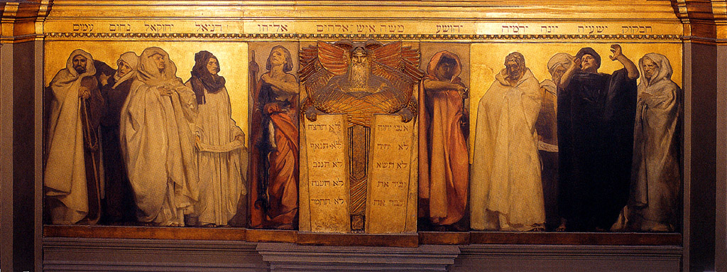
"Frieze of the Prophets." John Singer Sargent. Installed 1895. (Sargent Gallery, Boston Public Library)
Copyright © Edward Riojas

My, how times have changed.

One can hardly move through the public spaces of the United States without stumbling on a scar where a representation of the ten commandments once commanded a view. In the quest to equalize all citizens – especially the tiniest and most vocal minority groups – the Judeo-Christian segment of society has taken a massive hit. City halls and public schools and courthouses and libraries have become so sanitary that one wonders how any of our freedoms can freely roam at all.

Of course, this wasn’t always the case. During the late 1800s and early 1900s, the seeds of free thought were being sown almost willy-nilly, and at least one celebrated artist rather unintentionally set a high bar among public spaces.

John Singer Sargent, portrait painter of the rich and famous, and widely known for his then-controversial portrait of “Madame X,” was sharing a cavernous, English studio with another well-known artist, Edwin Austin Abbey. Abbey had been commissioned to paint a series of lavish murals to decorate a large gallery in the new McKim building of the Boston Public Library, and, in keeping with a romantic literary theme, based his 15 paintings on “The Quest and Achievement of the Holy Grail.” The quasi-religious, Arthurian legend was certainly enough to loudly inspire, even among the hush of library patrons.

While Abbey was working on his project in the studio, the building’s architect, Charles Follen McKim, gave a similar commission to Sargent for murals in a different gallery. The brilliant portraitist was given free reign on subject matter. Early on, Sargent leaned toward a theme based on the imagery of Spanish literature. And then he changed his mind.

Perhaps it was that Sargent knew his Boston audience. Perhaps the robust Irish-Roman Catholic population had something to do with it, or maybe it was the large Jewish community. Perhaps it was the emergence of off-beat belief systems, hybrids of existing religions, or simply his own curiosity that caused Sargent to choose the “Triumph of Religion” as his theme.

Sargent may have aimed at what, in his own mind, was a broad target, but the result can easily be viewed with a very narrow scope. Instead of including a truly global set of religions, inclusive of Far Eastern religions and those of Central Africa and South America, Sargent chose to highlight only those connected to civilizations mentioned in Holy Scripture. There is, for example, strange imagery of the Egyptian goddess, Neith, the Canaanite god, Moloch, and Gog and Magog, but that is where paganism ends in the murals.

The lion’s share of imagery contained in the Sargent Gallery highlights the Israelite’s oppression, Old Testament prophets, depictions of angels, a multitude of Marian-themed images, and, perhaps most significantly, a lovely image of the Holy Trinity and a sculpted crucifix commanding one end of the gallery. The Three Persons share a single robe emblazoned with “Sanctus, Sanctus, Sanctus...” Slightly below is a crucifix with Adam and Eve collecting the blood of Christ and, below His feet, an image of the Pelican in Her Piety.

Sargent’s gallery was never finished. Drawings exist of an intended addition, “The Sermon on the Mount,” but other commissions increasingly pulled the artist away and, ultimately, his own death ceased all work on the project.

It is questionable that a full accounting of his own beliefs can be construed from Sargent’s progress on the Boston Public Library. At one point, however, the artist was forced to repair damage to a section when disgruntled members of the Jewish community threw ink on a blindfolded representation of the Synagogue, and, in spite of attempting a mere historic view of Israel and the manifestation of the Messiah, it is remarkable that Sargent’s result is a decidedly lofty, if not edifying, set of murals. Perusing the library’s Sargent Gallery with its depiction of Old and New Testament imagery certainly puts to shame the collective public spaces of our entire nation, and, quite frankly, many of our churches, as well.

"Dogma of Redemption." John Singer Sargent. Installed 1903. (Sargent Gallery, Boston Public Library)


Friday, April 6, 2018

Certified

Copyright © Edward Riojas

We sometimes treat our pastors shamefully.

When we’re not thinking about the quality of Bible class coffee, we often grouse about the length of sermons, the shortfall of funds, the height of the pulpit, the depth of the Baptismal font, and the breadth of the pastor’s chasuble. We complain that cousin Citronella can’t commune with the rest of the family at Easter; we complain that the organist can’t play “Here comes the Bride” at our kid’s wedding; we complain that we’re singing that unbearably-long Luther hymn. Again. And we complain that we have to crack open a Bible during Bible study.


These may seem exaggerations, but there are untold stories regarding wayward sheep. Many are real head-scratchers. For the most part, pastors have that blessed ability to absorb such nonsense – stupidity and all – as if their main job description was playing the role of sanctuary piñata. They aren’t any such thing.

On the other hand, when the chips are down, when death pays a visit, when sin overwhelms us, they are the first to show up – not to give what the old Adam wants, but to give us the Scripture we truly need.

The Office of the Holy Ministry is a gargantuan blessing to us poor, miserable sinners. When given an opportunity to do it right by our pastors, we should splurge. That is why I’m releasing a newly-designed Ordination certificate and it’s close cousin, an Ordination Anniversary certificate.

While I took cues from some of Cranach’s book title pages, the entire design is original and is meant to edify. On the certificate, a pastoral stole displays symbols of the sacraments of Holy Baptism and the Lord’s Supper, along with a traditional nape cross, emblazoned in this case with the VDMA abbreviation which means “The Word of the Lord Endures Forever.” The stole is draped over a Shepherd’s cross composed of intersecting rod and staff – symbolizing the blessings of pastoral correction and guidance. Crossed keys symbolize the Office of the Keys, which is entrusted to called and ordained Ministers. A vignette of Christ in the role of the Sower adorns upper portions of the document. Luther’s Seal, the VDMA cross, and a space for a church seal run along the bottom. The whole background of stylized floral embellishment is actually a single, rich growth that originates from Holy Scripture, which, in turn, is underscored with three bookmarks as being Divinely inspired.


Some may argue that the certificate is too ornate or opulent. Others may argue that it looks too “catholic.” I will take both charges as high compliments. It is, however, a relatively simple gesture in honoring the Office of the Holy Ministry. For too long the Church has languished in 1960’s ugliness, and not even certificates escaped unscathed. Mod-squad motifs of sweeping lines and spare detail now only smack of embarrassing cuffed, bell-bottoms, polyester disco shirts, and ill-conceived perms for men. If we are to celebrate the Church as the Bride of Christ, then it’s time we put aside notions of showing up at the wedding wearing a marmish, plaid housecoat, and underscore instead the beauty and opulence and richness of all that the Lord sees through eyes of Redeeming Love.
________________________________

Both Ordination certificates are being offered as 11" x 17" giclée prints for $75 each, which includes digital text insertion for those not keen on hand-lettering the documents. To order or for more information, please e-mail me at edriojasartist@gmail.com

Friday, March 30, 2018

Banner Day for Christendom

Copyright © Edward Riojas

“The royal banners forward go...”

Legend has it that the Lenten hymn containing this phrase was written by Venantiaus Fortunatus to accompany a grand processional. The momentous event occurred in late 568 A.D. at Poitiers, when a supposed relic of the true cross was being presented to the church there. Fortunatus was given the distinction of formally receiving it, so it was that he and a contingent of dignitaries processed while singing the hymn.
"Resurrection" (Detail of fresco of
"Scenes from the Life of Christ."
Giotto. 1304-1306.
(Capella Scrovegni, Padua, Italy)

That legend slightly soils my appreciation for the hymn, but one would otherwise find it hard to stretch a Scriptural metaphor out of the title line. I seriously doubt royal banners were employed at common executions in Roman-occupied Jerusalem. Furthermore, Christians might view the cross of Christ as a singular royal banner, but not a multitude of them.

In sacred art, royal banners do appear, but not usually during the crucifixion of Jesus. The Resurrection is an entirely different matter. Banners became the rule in depictions of the Resurrection by the time the Proto-Renaissance rolled around, and it is Jesus Christ who carries them.

Origins of Christ holding a white banner emblazoned with a red cross are hard to find in Orthodox imagery. Oldest formulae in Orthodoxy show the resurrected Christ yanking Adam and Eve out of their graves. He pulls so hard at them that one wonders at the soundness of their rotator cuffs. When icons do give Jesus a free hand, He sometimes holds a staffed cross. Only in modern Eastern icons and Coptic icons do banners occasionally show up.
"Harrowing of Hell"
Martin Schongauer. 1480s.
(National Library of Russia,
St. Petersburg)


The Florentine artist, Giotto, was one of the earliest to depict the risen Christ with a resurrection banner. Soon others followed his lead, and it became a familiar pattern as the renaissance spread northward. But why the banner?

The answer doesn’t necessarily have to do with a living Christ. It points, instead, to the place from whence He just emerged. Holy Scripture briefly describes this in 1 Peter 3:18-20 – specifically with the phrase, “...He went and proclaimed to the spirits in prison.” He might have been proclaiming and preaching in hell, but it was a sermon of fire and brimstone and not much else. Christ descended into hell to proclaim victory over Satan and his minions. The banner is a victory flag.

One must be extremely careful to not read purgatorial nonsense into the passage of 1 Peter. Many have, and the result has created a whole genre of “the harrowing of hell,” which is Scriptural in name only. There is enough art to further the heresy. The Example by Schongauer, along with many similar images, borrows a motif from orthodox imagery and applies it incorrectly to Christ's visit to hell, showing Christ pulling “saints” out of hell. Scripture simply does not say that folks get a second chance after they are dead and gone. It doesn’t happen.
"Resurrection of Christ with Donor Family"
Lucas Cranach the Younger. c. 1573.
(Private collection)


But the resurrection DID happen, and it was a banner day for all believers. Remember that the next time you see a depiction of Jesus Christ – or the Lamb of God – holding a banner. It symbolizes that He has conquered sin, death, and hell, and has firmly rubbed Satan's nose in that fact.

Friday, March 23, 2018

For Holy Week

Copyright © Edward Riojas

They say a picture is worth a thousand words. Today I'm letting a new piece do the talking, with minimal textual intrusions to explain some symbolism. "Crucifixion" was recently installed at Zion Lutheran Church, Garret, Ind.

Tabula Ansata: The inscription here follows a traditional artistic formula. It is a gross abbreviation of "Jesus of Nazareth king of the Jews" in Latin. The full wording was not only in Latin, but Greek and Aramaic, as well.


Christ's hand: Though fixed to the cross, His hand is in the attitude of blessing.


Crowned with glory: Jesus wears a crown of thorns, but His tri-radiant nimbus shows Him to be a Person of the Holy Trinity and true God.


From His pierced side: Blood and water flow, blessing us with the Sacraments of Holy Baptism and the Lord's Supper.


Place of a skull: Some traditions place the crucifixion of Jesus on the site of Adam's grave, underscoring Christ's victory over death and a reversal of man's Fall.


Bloodied, pierced feet: "How beautiful are the feet of those who preach the good news!"


__________________________

Giclée prints available: Images of "Crucifixion" are available as signed giclées prints on Hahnemuehle fine art paper. Two sizes are available: 12" x 18" for $80, and 15.9" x 24" for $120. Please email the artist at edriojasartist@gmail.com to order or for more information.